
Aesthetic Presentation: Soft Slides That Stay Readable
Aesthetic slides come from restraint, not decoration: one soft palette, one type family and generous white space, without giving up readability.

What makes a presentation aesthetic, and how to build one
An aesthetic presentation looks calm, tidy and pleasant: soft but limited colours, simple type, generous white space, and the same pattern on every slide. You get there by restricting choices, not by adding decoration. Pick one palette with no more than three colours plus a neutral, one or two simple typefaces, one image style, and repeat that system on every slide.
An aesthetic deck still has to be readable. Microsoft Support recommends avoiding font sizes smaller than 18 pt, choosing simple fonts such as Arial or Calibri, and using high contrast between the background and the text. W3C's WCAG 2.2 sets a minimum contrast ratio of 4.5:1 for normal-size text. This is where many pretty decks fail: the pastel colours that make them look good are often too pale to use for text.
This guide walks through each step, from palette, type and background to layout and a final test before you present. You will also find four ready-made palettes with hex codes and measured contrast ratios. If you want the general design basics first, start with our guide to presentation design.
Choose a soft palette, then cap the number of colours
The easiest way to spot an aesthetic deck is the colour: sage, dusty pink, misty blue, sand or cream. These colours feel soft because their saturation is low. The catch is that soft colours look messy quickly when there are too many of them. A practical rule is one light background colour, one dark text colour, and one accent colour for lines, icons or markers.
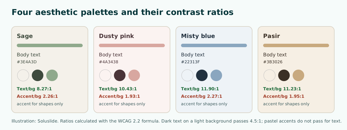
The table below lists four palettes you can use straight away. We calculated the contrast column ourselves with the WCAG 2.2 contrast ratio formula, so there is no guesswork.
Scroll the table sideways to see every column.
| Palette | Background | Text | Accent | Text contrast | Accent contrast |
|---|---|---|---|---|---|
| Sage | #F4F1EA | #3E4A3D | #8FA98C | 8.27:1 (pass) | 2.26:1 (shapes only) |
| Dusty pink | #FBF3F1 | #4A3438 | #D8A7A0 | 10.43:1 (pass) | 1.93:1 (shapes only) |
| Misty blue | #EEF3F7 | #22313F | #8AA6BF | 11.90:1 (pass) | 2.27:1 (shapes only) |
| Sand | #F6EFE4 | #3B3026 | #C8A97E | 11.23:1 (pass) | 1.95:1 (shapes only) |
Look at the last column. Every pastel accent lands around 2:1 against its background, far below 4.5:1. That means the accent should never carry body text. Use it for a thin rule above the title, an icon background or a number marker, and keep text in the dark palette colour. More colour combinations are in our PowerPoint colour palette guide, and checking contrast is covered in readable presentation contrast.
Typography: simple, one family, large enough
Many people assume an aesthetic deck needs a handwritten script or a very thin serif. A characterful face can work for a short title. For body text, Microsoft Support recommends simple fonts and warns against very thin or decorative ones, which are hard to read from a distance, especially at small sizes.
A safe pattern for aesthetic slides:
- One font family for titles and body, separated by weight, for example Bold titles and Regular body text.
- If you want two fonts, keep the characterful one for titles only and use a plain sans serif for body text.
- At least 18 pt, as Microsoft Support suggests, and larger for a big room.
- All lowercase or all caps only for very short titles.
Slightly looser line spacing also makes a slide feel lighter without adding a single element. A list of fonts that read well from the back of the room, and how to install them, is in our guide to the best fonts for presentations. If the deck will open on another computer, pick fonts that machine has or embed them, so your careful look does not fall back to a substitute font.
Backgrounds and images: subtle, consistent, never competing
Backgrounds are where people overdo it most. Microsoft Support advises subtle, consistent slide backgrounds and a template or theme that is not too eye-catching, so the design does not pull attention from the message. For an aesthetic look, a plain cream or very light grey background is enough. If you want texture, choose a faint paper grain.
Images follow the same rule. Choose one photo style for the whole deck: all natural-light photos with warm tones, for example, or all thin-line illustrations. Mixing studio shots, cartoons and three icon styles is the fastest way to lose the aesthetic feel. Microsoft Support also warns against overwhelming a slide with too many graphics.
- Use one large image per slide instead of five small ones.
- Leave space around the image rather than running it to the edge.
- If text sits on a photo, add a semi-transparent background panel so contrast holds.
Free image sources and how to choose them are in our guide to images for PowerPoint, background ideas are in PowerPoint backgrounds, and matching icon sets are in PowerPoint icons.
Layout and white space
White space is the main ingredient of an aesthetic slide. The same content can look cheap or premium purely because of spacing. Microsoft Support recommends keeping text minimal, using short one-line bullets, and notes that some projectors crop slides at the edges, so long sentences may be cut off. That advice also helps the look: less text means more breathing room.
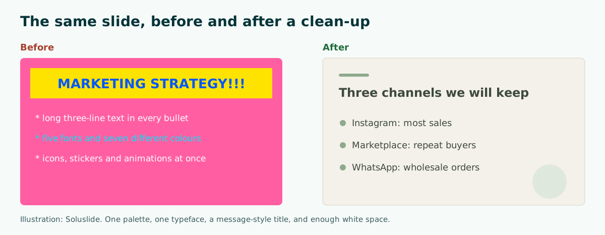
Habits that make a layout feel tidy:
- Set the same margin on every side and keep it on every slide.
- Left-align all text, except perhaps a short title on the opening slide.
- Use a simple grid, such as two columns for text and image.
- Lock repeating elements such as slide numbers and accent lines in the Slide Master instead of pasting them on each slide.
PowerPoint's built-in layouts and when to use each one are covered in our PowerPoint layout guide.
Using Designer and PowerPoint themes
If you use PowerPoint for Microsoft 365, there is an official shortcut. Microsoft Support explains that Designer works in the background to match your slide content to professionally designed layouts, and you can ask for ideas any time from the Design tab by selecting Design Suggestions. Pick an idea in the pane and the slide changes; press Ctrl+Z if you do not like it.
Designer helps with layout, but it does not make a deck aesthetic on its own. To keep results consistent:
- Set your palette and fonts in the theme first, then ask Designer for suggestions.
- Choose the suggestion with the most white space, not the busiest one.
- Reuse the same arrangement for similar slides, for example every data slide in the same layout.
Microsoft Support also notes that Designer is a Microsoft 365 subscriber feature and may ask for permission to use connected experiences the first time. Without Microsoft 365, a built-in PowerPoint theme is still a fine starting point; swap its colours for one of the palettes above. Customising and saving your own theme is covered in PowerPoint themes, and free starting files are listed in free PowerPoint templates.
Example: a one-page style brief
The quickest way to stay consistent is to write a short style brief before you build any slides. It also helps when you work in a team or hand the deck to a designer. Here is an example for a small bakery's promotion plan:
Style: aesthetic, calm, warmPalette: background #F4F1EA, text #3E4A3D, accent #8FA98C (accent for lines and icons only)Type: one sans serif family, titles Bold 36 pt, body Regular 20 ptImages: natural-light product photos, warm tones, one large photo per slideLayout: equal margins on all sides, left-aligned text, no more than 3 points per slideFixed elements: accent line above titles and slide numbers, set in the Slide MasterNot allowed: more than 3 colours, decorative fonts for body text, heavy animationWith a brief like this, everyone who touches the file produces slides that look like one family. Keep the brief on a hidden final slide or in the speaker notes of slide one. For making the content itself compelling, not only the look, see how to make a presentation interesting.
Animation and transitions: keep them light
An aesthetic deck feels calm. Bouncing or spinning animations, or a different transition on every slide, break that feeling quickly. If you use motion, pick one gentle transition such as Fade for the whole deck, and use animation only to show an order or a change that matters to the message.
The same goes for decoration. Stickers, emoji and floral frames may look cute on one slide, but on every slide they split the audience's attention. Microsoft Support reminds presenters that you want people to listen to you, rather than read the screen. That principle applies to decoration too: the audience should get the message first and enjoy the look second.
Choosing transitions that do not distract is covered in PowerPoint transitions, and using animation to explain a sequence is in PowerPoint animation.
Common mistakes with aesthetic slides
The aesthetic look is easy to copy from a social media screenshot, but a few mistakes keep appearing when it moves into a real presentation. A presentation is not a social post: it is read from a distance, shown through a projector, and has to land a message in limited time.
- Pastel text. It looks sweet on a laptop and almost disappears on a projector. Keep pastels for shapes and lines.
- Script fonts for body text. Fine for one word in a title, tiring for three lines of bullets.
- Tiny type for a minimal feel. Minimal means fewer elements, not smaller letters. Stay at 18 pt or more.
- A different style on every slide. Aesthetic decks feel tidy because they repeat. A fifth slide in a new palette breaks the spell.
- Content cut to protect the look. Splitting a point across two slides is better than deleting it.
The quickest fix for all of these is to finish the content first and apply the style second, so the look serves the message. If you will present to a formal audience, our tips on how to give a good presentation are a useful next read.
Test before you present: projector, distance and contrast
Aesthetic decks are most at risk on presentation day, because soft colours fade easily on a projector. Microsoft Support advises checking all colours on the projection screen before the real presentation, since colours may project differently from your monitor. It also recommends making sure the projector resolution matches the computer you built the deck on, so slides are not cropped.
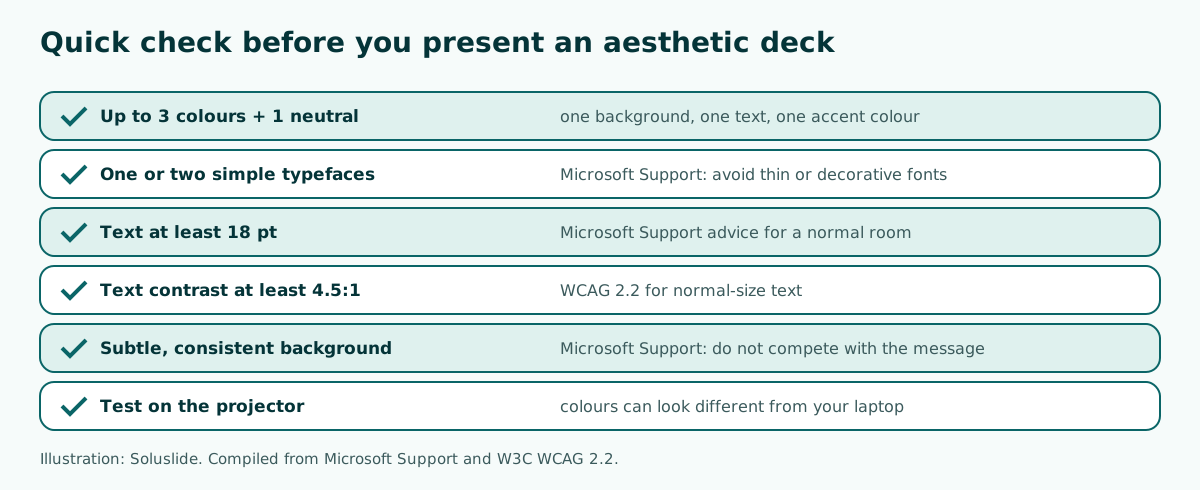
If you cannot try the projector, run a simple test: put the slide on your laptop, step back three or four paces, and read the title and the first point. If you have to squint, increase the font size or darken the text colour. To make sure the content flows before you polish it, see our guide to presentation structure.
If you would rather start from a ready outline, Soluslide can draft slide titles, points and speaker notes from a topic and export an editable .pptx. You then apply the palette and fonts from your style brief in PowerPoint.
Frequently asked questions
What is an aesthetic presentation?
A calm, tidy deck with soft but limited colours, simple type, generous white space, and the same pattern on every slide.
How many colours should an aesthetic deck use?
Up to three colours plus a neutral: one light background, one dark text colour, and one accent for lines or icons.
Can I use pastel colours for text?
Better not. In our test, pastel accents measured about 2:1 against a light background, while WCAG 2.2 asks for at least 4.5:1 for normal text.
Which fonts suit an aesthetic presentation?
Simple fonts from one family, separated by weight. Microsoft Support advises avoiding very thin or decorative fonts for body text.
What is the minimum font size for slides?
Microsoft Support suggests avoiding sizes smaller than 18 pt, and going larger for a big room.
How can I make slides look aesthetic quickly in PowerPoint?
Set your palette and fonts in the theme, then use Design Suggestions on the Design tab to get Designer ideas (Microsoft 365). Pick the suggestion with the most white space.
Do animations fit an aesthetic deck?
Sparingly. Use one gentle transition for the whole deck and animation only for sequences that matter.
Why do my slide colours look faded when presenting?
Projectors can show colours differently from your monitor. Microsoft Support recommends checking colours on the projection screen before you present.
Sources
Factual claims in this article refer to the sources below. Sample outlines and prompts are illustrations to adapt.
Related reading
Try shaping your own outline. You can review and edit it before signing in.
Build a free outline