
Meeting Presentation for Agencies: From Status Updates to Decisions
A coordination meeting is not a reporting session. Here is how to structure the deck so every agenda item ends with a decision, a named owner and a date.

What a meeting presentation should actually do
A meeting presentation for a public agency or any multi-unit organization has one job: help the people in the room make decisions they could not make by reading a report on their own. If the slides only repeat what each unit already wrote in its weekly update, the meeting becomes a long reading session and nobody leaves with a clear next step.
The practical test is simple. When the meeting ends, every agenda item should have produced one of three outcomes:
- A decision (approve, reject, choose option B, postpone with a reason).
- An action with one named owner and a target date.
- A noted item that is explicitly marked as information only, so nobody spends twenty minutes debating it.
Everything in the deck should serve that test. Progress percentages, photos of field activities and long lists of completed tasks belong in an appendix or a pre-read. The main slides should show where the work is blocked, what options exist, and what the room is being asked to decide. The rest of this guide shows how to build that structure, keep it readable in a real meeting room, and close the loop afterwards with minutes and an action log.
Turning status updates into decisions
Most coordination decks are assembled the same way: each division sends three or four slides, someone stitches them together, and the meeting walks through them in organizational order. The result is predictable. The first presenters get plenty of time, the last ones are rushed, and the one issue that actually needed the director's signature is buried on slide 37.
The fix is to reorganize by what the room must do, not by who is reporting. Before building slides, sort every item the units send into one of these categories:
Scroll the table sideways to see every column.
| Category | What it looks like | Where it goes in the deck | Time to allocate |
|---|---|---|---|
| Decision needed | Two or more options, a deadline, someone who cannot proceed without approval | Main section, one slide per decision | Most of the meeting |
| Blocker or risk | Work is stalled because of another unit, budget, data or a supplier | Main section, right after related decisions | Short discussion, then assign an owner |
| On track | Milestones met, nothing needed from the room | One summary slide or a table in the appendix | Under a minute total |
| Information only | Announcements, schedules, reminders | Pre-read or final slide | Read, not discussed |
Once you sort this way, the shape of the meeting changes. A 60-minute coordination meeting with three real decisions and two blockers can spend about 40 minutes on those five items and handle everything else in a few minutes at the end. Units that are on track lose nothing, because their status still appears in the summary table, and the people with real problems finally get airtime.
Ask contributors for the right input
The easiest way to get decision-ready slides is to change the template you send to units before the meeting. Instead of asking for "your progress update", ask four questions: What changed since the last meeting? What is blocked and why? What do you need the room to decide, and by when? What are the options and your recommendation? Units that answer "nothing" to the last two go straight into the on-track table.
Slide structure for a coordination meeting
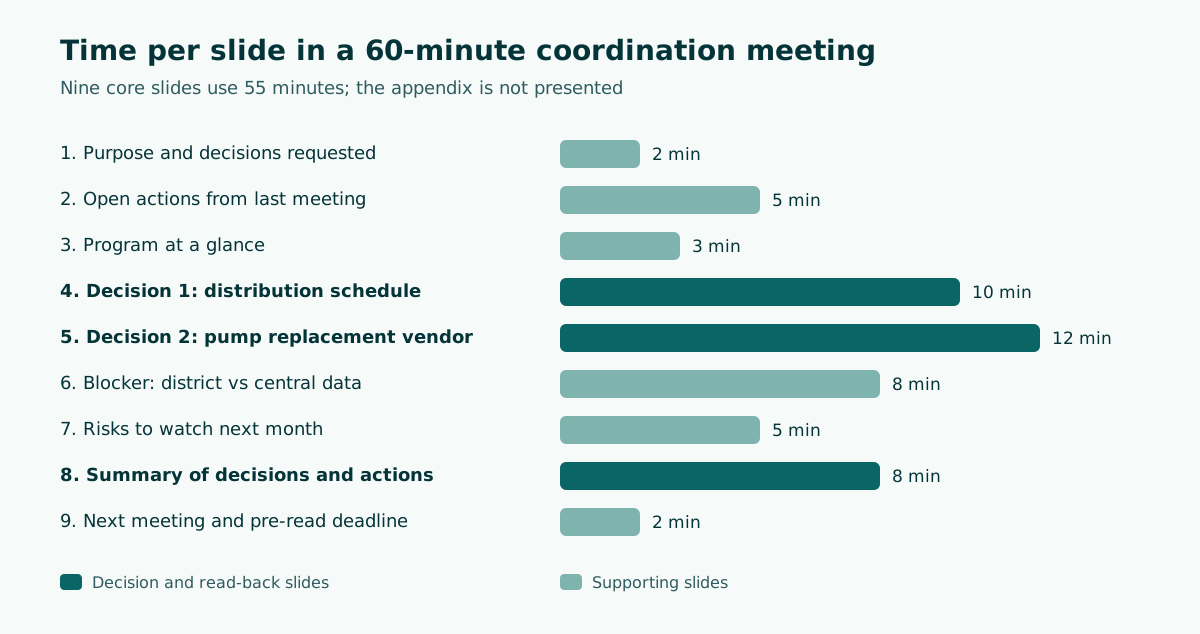
A coordination meeting deck works best with a fixed skeleton that participants learn to expect. When the structure is the same every week or every month, people know where to look, and the chair can move faster. Here is a worked example for a 60-minute interagency coordination meeting on a regional program, with time per slide.
Coordination meeting: Regional Clean Water Program, monthly review (60 min)

1. Purpose and decisions requested today (2 min)
   - Approve revised distribution schedule
   - Choose vendor option for pump replacement
   - Assign owner for data reconciliation with district offices
2. Open actions from last meeting (5 min)
   - Table: action, owner, due date, status (done / late / blocked)
3. Program at a glance (3 min)
   - One table: 6 workstreams, status, next milestone
4. Decision 1: Revised distribution schedule (10 min)
   - Problem, two options, impact, recommendation
5. Decision 2: Pump replacement vendor (12 min)
   - Comparison table: cost, delivery time, maintenance terms
6. Blocker: District data does not match central records (8 min)
   - What is wrong, consequence, proposed owner and date
7. Risks to watch next month (5 min)
8. Summary of decisions and new actions (8 min)
   - Read back each decision and action, confirm owner and date
9. Next meeting date and pre-read deadline (2 min)
Appendix: detailed workstream reports, photos, raw data
Notice three things about this outline. The first slide states the decisions requested, so everyone knows from the start why they are there. The open actions from the previous meeting come early, which creates accountability without a lecture. And the read-back slide near the end is reserved time, not an afterthought; it is where vague agreements become specific commitments.
If you are building the deck from a long written report, the same principle applies: pull out the decisions first and let the narrative support them. Our guide on turning a document into a presentation walks through that extraction step in more detail.
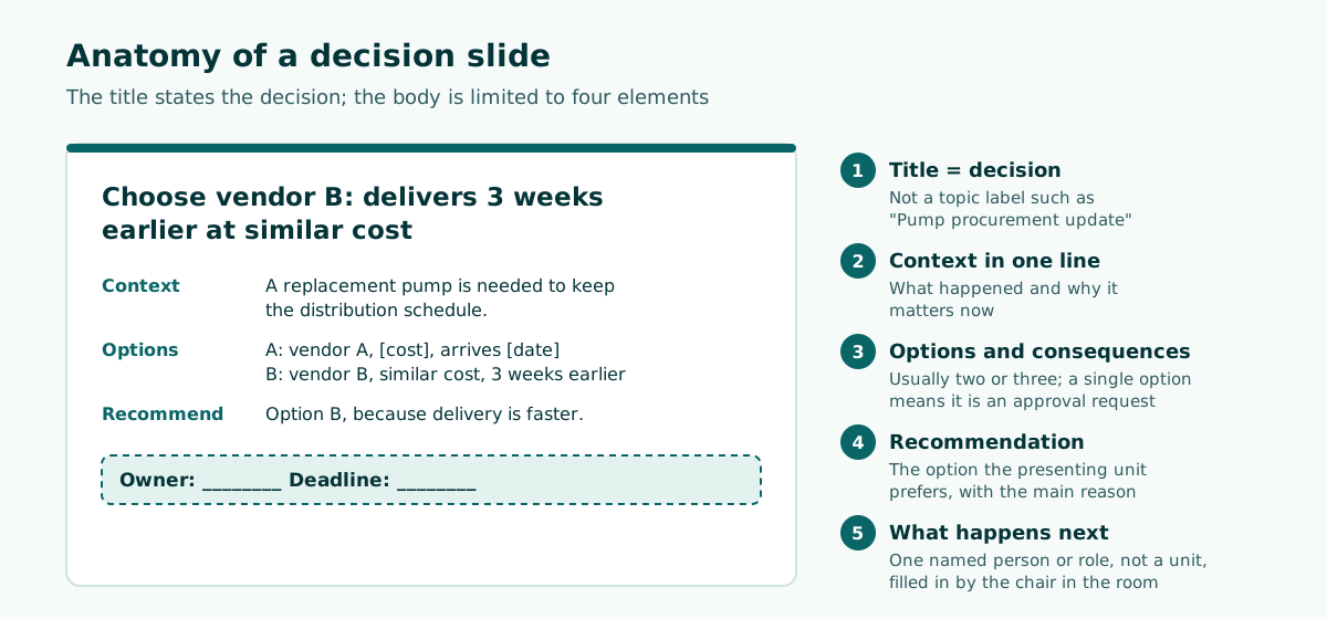
Anatomy of a decision slide: owner, deadline, options
A decision slide should be understandable even to someone who walks in late. That means the slide title states the question or the recommendation, not just a topic label. Compare these rewrites:
Scroll the table sideways to see every column.
| Weak title (topic only) | Stronger title (decision or finding) |
|---|---|
| Pump procurement update | Choose vendor B: delivers 3 weeks earlier at similar cost |
| Data reconciliation | District and central figures differ; we need one owner by Friday |
| Training progress | Training is on track; no decision needed |
| Budget | Approve moving unspent travel funds to field repairs |
Below the title, keep the body to four elements:
- Context in one line. What happened and why it matters now.
- Options. Usually two or three, each with its main consequence. If there is only one option, it is an approval, so say so.
- Recommendation. Which option the presenting unit prefers and the main reason.
- What happens next. A placeholder line such as "Owner: ____ Deadline: ____" that the chair fills in during the meeting.
That last element is small but powerful. An empty owner field projected on the screen makes it visibly awkward to move on without naming someone. It also makes the minute-taker's job easier, because the action is already formatted.
One owner, not a unit
Write a person's name or a specific role, not a whole department. "Finance Division" cannot be followed up; "Head of Budget Section" can. When an action genuinely needs several units, name one coordinator who is responsible for pulling the others together and reporting back.
Readability in a real meeting room
Meeting rooms are often harder on slides than conference halls. Projectors are older, lights stay on so people can take notes, and some participants sit at the far end of a long table or join remotely on a small laptop screen. A slide that looks fine on your monitor can be unreadable from the back.
A few rules make a large difference:
- Use large text. Microsoft's accessibility guidance for PowerPoint recommends a larger font size (18pt or larger), sans serif fonts and sufficient white space. Treat 18pt as a floor for body text, not a target; titles and key numbers should be much bigger.
- Choose plain fonts. The W3C Web Accessibility Initiative notes that simple fonts with consistent thickness are often easier to read from a distance, and recommends making text and important visuals big enough to be read even from the back of the room.
- Check contrast. The WCAG contrast criterion sets a minimum ratio of 4.5:1 for normal text and 3:1 for large-scale text. These figures come from web accessibility, but they are a useful benchmark for slides as well, especially when a projector washes out colors. PowerPoint's Accessibility Checker can flag insufficient contrast for you.
- Give every slide a unique title. Microsoft recommends this for screen reader users, and it also helps sighted participants who are trying to find "the slide about the vendor" in a 30-slide deck.
- Move detailed tables to the appendix. If a table has more than about six rows, show only the rows the room must discuss and keep the full version in the pre-read.
For a deeper look at color pairs and why some combinations fail on projectors, see our article on readable presentation contrast.
Test from the back
Before an important meeting, open the deck on the room's projector and look at it from the farthest seat. Five minutes of testing will reveal thin fonts, low-contrast charts and labels that are too small far more reliably than any rule of thumb.
Running the meeting with the deck
Slides support the chair; they do not run the meeting. A few practices keep the deck in that supporting role.
Send it in advance. The W3C guidance on accessible presentations advises speakers to provide slides, handouts and other material to participants ahead of time. For coordination meetings this has an extra benefit: people arrive having read the status sections, so the meeting can start with the decisions.
Use presenter view. PowerPoint's Presenter View shows the current slide, the next slide and your speaker notes, along with a slide timer you can pause or reset. Put the key numbers and the recommended decision in the notes so the presenter does not need to read the slide aloud.
Describe what matters on charts. Do not say "as you can see". Say what the chart shows: "Disbursement in the two eastern districts is half of the plan." The W3C recommends that speakers describe pertinent visual information, which helps remote participants, people with low vision and anyone sitting too far away to read the axis labels.
Keep time per item visible. Put the planned minutes next to each agenda item on the opening slide. When a discussion runs over, the chair can point to it and either close the item or explicitly move it to a follow-up meeting with a named owner.
Read back before closing. Spend the last minutes on the summary slide. Read each decision and each action aloud, confirm the owner and the date, and correct anything that sounds different from what people thought they agreed to. This step prevents most of the "that is not what we decided" emails that arrive later.
Follow-up: minutes and the action log
A meeting presentation is only half of the record. The other half is the minutes, and the bridge between them is the action list.
Good minutes are not transcripts. Loughborough University's committee guidance says minutes are not a verbatim record and advises concentrating on conclusions and decisions, and on actions and who is responsible for carrying them out. The University of Manchester's governance handbook gives similar advice: minutes should indicate responsibility for actions, key deliverables and timescales, and it is good practice to keep actions both in the minutes and in a separate action log. The same handbook says actions should normally include a target date for completion.
A practical follow-up routine for coordination meetings looks like this:
- Same day: the secretariat circulates a short summary of decisions and actions, copied directly from the read-back slide.
- Within a few working days: full minutes are circulated for correction, following your organization's own procedures.
- Before the next meeting: owners update the status of their actions in the shared action log.
- At the next meeting: the "open actions" slide is generated from that log, so overdue items are visible without anyone having to raise them.
Here is a sample action log row that works both as a slide table and as a spreadsheet line:
No. | Action                                         | Owner                    | Due        | Status
07  | Reconcile district water data with central DB  | Head of Data Unit        | 14 Nov     | In progress
08  | Issue purchase order to selected pump vendor   | Procurement Officer      | 21 Nov     | Not started
09  | Send revised distribution schedule to districts| Program Coordinator      | 10 Nov     | Done
Because the log carries over from meeting to meeting, the next deck partly builds itself. That is the real payoff of structuring the presentation around decisions: the presentation, the minutes and the follow-up all use the same units of work.
Building the deck faster without losing the structure
The slowest part of preparing a coordination deck is usually not design; it is collecting updates, sorting them and writing titles that say something. A few habits cut that time:
- Keep a master template with the fixed skeleton above (purpose, open actions, at a glance, decisions, blockers, risks, read-back, next meeting). Only the decision and blocker slides change significantly from one meeting to the next.
- Draft titles first. Write all slide titles as full sentences before adding any content. If you cannot write a decision title for a slide, it probably belongs in the appendix.
- Use AI for the outline, not for the facts. An AI tool can propose a timed outline from your notes or a long report, but every number and every owner name must come from your own sources. Our guide to prompts for AI presentations includes examples you can adapt for meetings, and the overview of AI presentation makers explains what these tools do well and where they fall short.
- Insist on an editable file. Agency decks get edited by several people up to the last minute. A deck exported as flat images is a dead end; you want real text boxes that anyone can correct. The article on editable PPTX from AI tools explains what to check.
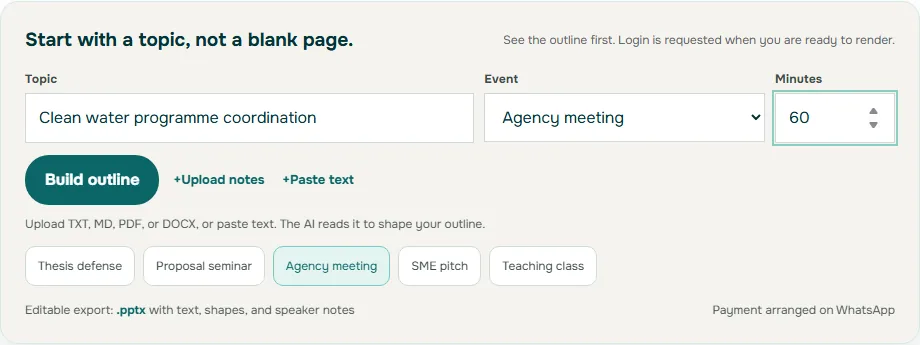
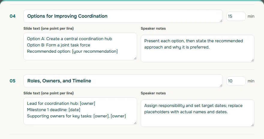
Soluslide, currently in beta, is built for this kind of preparation. You can enter a topic, choose the meeting event type and duration, or upload a report or notes, and it returns a timed slide outline with titles, notes and minutes per slide that you can edit before signing in. With a beta account you can export an editable .pptx made of standard text boxes and shapes, then add your own figures and owners. You can try the outline builder or read more on the features page.
If you are still choosing a tool, judge its exported file with the criteria in our Gamma alternative comparison. When the meeting is really a funding or approval pitch, the structure in the AI pitch deck guide adapts well. Sample beta plans are listed on the pricing page.
Pre-meeting checklist
Use this list the day before the meeting. If you can tick every line, the deck is ready.
- The first slide lists the specific decisions requested today.
- Every agenda item is labeled as decision, blocker, on track, or information only.
- Each decision slide has a title that states the question or recommendation, two or three options, and an empty owner and deadline line.
- Open actions from the previous meeting appear early, pulled from the action log.
- Status of on-track work fits in one table; detailed reports are in the appendix or pre-read.
- Body text is at least 18pt in a plain sans serif font, and contrast has been checked.
- Every slide has a unique title.
- The deck and pre-read were sent to participants in advance.
- Speaker notes carry the key numbers so presenters do not read slides aloud.
- A read-back slide is scheduled near the end with enough time to confirm every owner and date.
A meeting run this way is shorter, and the follow-up is easier, because the presentation was designed from the start to produce decisions rather than to display activity.
Frequently asked questions
How many slides should a coordination meeting presentation have?
There is no fixed number. A useful rule is one slide per decision or blocker, plus a fixed opening, an open-actions slide, a one-table status summary and a read-back slide. Detailed reports go in an appendix or pre-read.
What should the first slide of a meeting presentation show?
The purpose of the meeting and the specific decisions the room is being asked to make, ideally with the planned minutes for each agenda item. This tells participants from the start why they are there.
What font size is readable in a meeting room?
Microsoft's accessibility guidance recommends 18pt or larger with sans serif fonts. Treat 18pt as a minimum for body text, make titles and key figures larger, and test the deck from the back of the actual room.
Should meeting minutes record everything that was said?
No. University committee guidance such as Loughborough's states minutes are not a verbatim record and should focus on conclusions, decisions, actions and who is responsible for them.
How do I make sure actions are followed up after the meeting?
Give every action one named owner and a target date, keep them in a separate action log as well as the minutes, and open the next meeting with a slide showing the status of those actions.
Can an AI tool build my meeting presentation?
It can speed up the outline and slide titles, but facts, figures and owner names must come from your own sources. Make sure the output is an editable file so colleagues can correct it before the meeting.
What goes on a decision slide in a meeting presentation?
A title that states the decision or recommendation, then four elements: one line of context, two or three options with their consequences, the recommendation with its main reason, and an owner and deadline line filled in during the meeting.
Sources
Factual claims in this article refer to the sources below. Sample outlines and prompts are illustrations to adapt.
- Microsoft Support: Make your PowerPoint presentations accessible to people with disabilities
- W3C WAI: Understanding Success Criterion 1.4.3 Contrast (Minimum)
- W3C WAI: How to Make Presentations Accessible to All
- Microsoft Support: Use Presenter View in PowerPoint
- The University of Manchester: Governance handbook, Minutes and actions
- Loughborough University: Committee minutes, guidance for note-taking and writing
Related reading
Try shaping your own outline. You can review and edit it before signing in.
Build a free outline