
PowerPoint Layout: How to Choose, Change, and Customize Slide Layouts
A layout decides where the title, text, pictures, and charts go. This guide covers what a layout contains, how to change it, how to build your own, and how to pick one from the slide content.

What a PowerPoint layout is
A PowerPoint layout, or slide layout, is a built-in arrangement that decides where the title, text, pictures, tables, and charts go on a slide. According to Microsoft Support, slide layouts contain formatting, positioning, and placeholder boxes for all of the content that appears on a slide. Placeholders are the dotted-line containers that hold titles, body text, tables, charts, SmartArt graphics, pictures, videos, and sounds.
Layouts also carry the colors, fonts, effects, and background that together make up the theme. So when you switch PowerPoint themes, every layout changes its look, while the position of its boxes stays the same.
The practical benefit is large. You do not have to drag text boxes around on every slide. Pick the layout that suits the content and type into its placeholders. The title lands in the same spot every time, font sizes stay consistent, and the deck looks tidy even when several people work on it. The wider principles of visual layout are covered in our guide to presentation design.
The parts of a slide layout
Every layout is built from placeholders. The most common are a title placeholder at the top and one or two content placeholders beneath it. Along the bottom there is usually room for the date, the slide number, and a footer.
Content placeholders are flexible. Inside them sit small icons for inserting a table, chart, SmartArt graphic, picture, or video. Click the table icon and the table fills that area at the right size. Building the table itself is covered in how to make a table in PowerPoint, and charts in how to make a graph in PowerPoint.
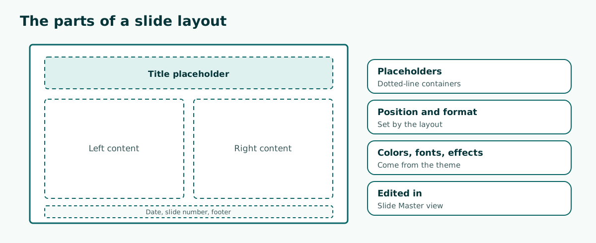
One distinction matters: a placeholder is not an ordinary text box. A text box you draw yourself sits outside the layout, so it is not repositioned when the layout or theme changes. In a deck full of manual boxes, tidying up can take a long time. Fill your slides through placeholders whenever you can.
How to change a slide layout in PowerPoint
Changing a layout takes a few clicks. These steps follow Microsoft's guide:
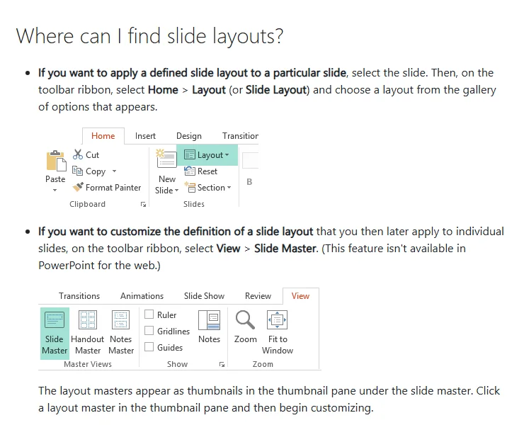
- Select the slide whose layout you want to change in the thumbnail pane.
- On the Home tab, select Layout (called Slide Layout in some versions).
- Choose a layout from the gallery that appears.
Content already in placeholders moves into the placeholders of the new layout. If the new layout has fewer placeholders, content without a home usually stays on the slide, and you will need to tidy it by hand.
For a new slide you can choose the layout up front. Click the arrow on the New Slide button and pick the layout you need. That is quicker than adding a blank slide and changing it afterwards.
How to edit or create your own layout in Slide Master
When the built-in layouts do not fit, change their definition in Slide Master view. According to Microsoft Support, the steps are:
- On the View tab, click Slide Master.
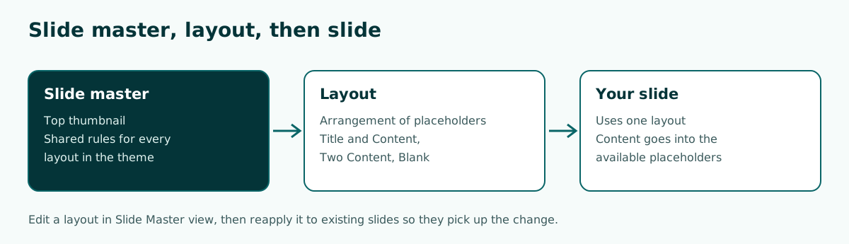
- In the thumbnail pane, pick the layout whose arrangement is closest to what you want. The slide master is always the top thumbnail and the layouts sit beneath it.
- To add a placeholder, on the Slide Master tab click Insert Placeholder, choose a type, and drag it onto the layout.
- Right-click the layout, choose Rename Layout, and give it a clear name.
- Click Close Master View.
Microsoft also flags a step people often miss: after editing a layout, you must reapply it to slides that already use it. Select those slides in Normal view (hold Ctrl to select several), then on the Home tab click Layout and choose the updated layout. If none of the layouts suit you, Microsoft suggests starting from the Blank Layout and adding your own placeholders.
Slide Master view is not available in PowerPoint for the web. The master itself is covered in depth in slide master in PowerPoint.
Layouts in Google Slides
Google Slides uses the same idea. The Google Docs Editors Help defines a layout as the way your text and images are arranged on a slide, and a theme as a preset group of colors, fonts, background, and layouts.
To change a layout in Google Slides: open the presentation on a computer, select a slide, click Layout at the top, and select the layout you want. The principle matches PowerPoint: fill the layout's own boxes so the design holds when the theme changes.
If your deck moves between Google Slides and PowerPoint, check the layouts after converting. The names and the number of layouts can differ, and slides typed into manual text boxes are the ones that shift most often. Moving between formats is covered in convert Google Slides to PowerPoint. One safe habit is to give slides with the same job the same layout across the deck, for example every bullet slide on Title and Content. Conversions go more smoothly and revisions get quicker.
Choosing a layout from the slide content
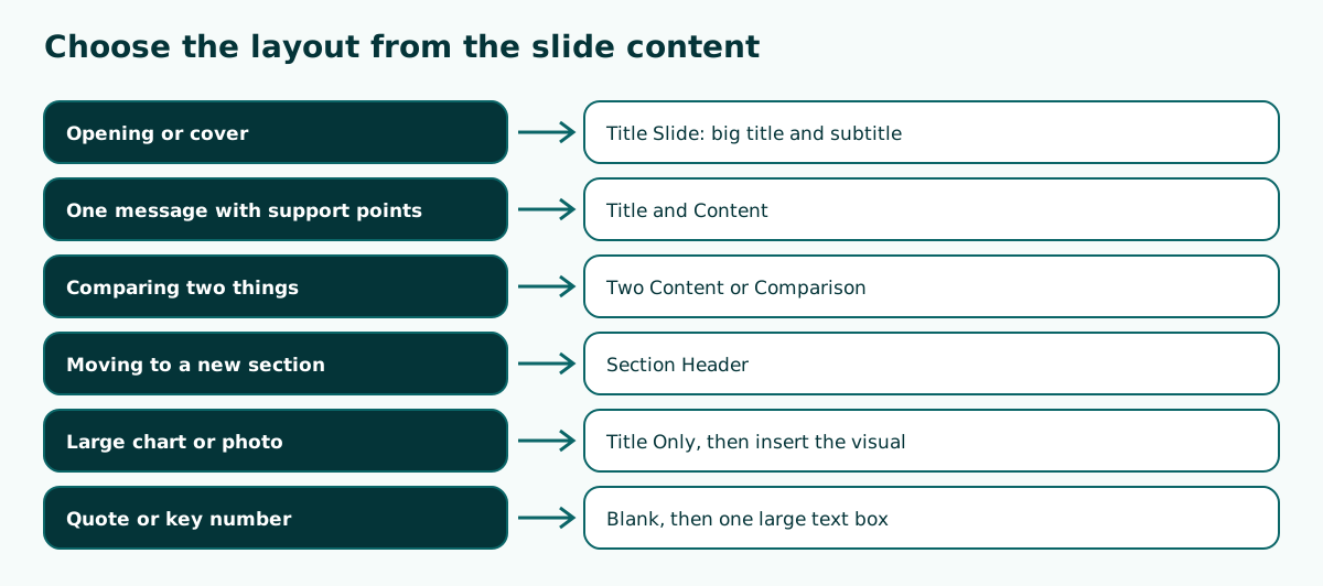
The most common mistake is picking a layout because it looks appealing rather than because it fits the content. Start from two questions: what is the single message of this slide, and what shape is the content? The table maps content types to built-in layouts whose names are common in the default Office theme.
Scroll the table sideways to see every column.
| Content type | Layout that fits | Note |
|---|---|---|
| Opening or cover | Title Slide | Deck title, name, date |
| One message with support points | Title and Content | A few short points at most |
| Two options or before and after | Two Content or Comparison | Keep both columns balanced |
| Moving to a new section | Section Header | Tells the audience where they are |
| Large chart or photo | Title Only | The visual fills the lower area |
| A quote or one key number | Blank | One large text box in the middle |
Slide size affects layout too. A 16:9 slide gives two columns more room than 4:3. If you are unsure, read PowerPoint slide size before you design.
Example: laying out a six-slide team meeting deck
Say you are preparing a ten-minute monthly sales review. Before you open the layout gallery, write an outline per slide and assign a layout to each line:
1. October Sales Review            -> Title Slide
2. Summary: target vs actual       -> Title and Content
3. Region A compared with Region B -> Comparison
4. Three-month sales trend         -> Title Only + chart
5. Obstacles and the fix plan      -> Two Content
6. Decisions we need today         -> Title and Content
With an outline like this, you no longer stall over layouts halfway through. Every slide has a job, and the layout simply follows it. Slide 4 uses Title Only on purpose so the chart gets the full area. Slide 6 returns to Title and Content because it holds a short list of decisions.
You can reuse the pattern for other talks. For a logical order of sections, read presentation structure, and for a meeting-style deck see meeting presentation.
From outline to layout with Soluslide
The hard part of choosing layouts is rarely the PowerPoint menu. It is deciding what goes on each slide, and that is where an outline helps. Soluslide drafts a presentation outline from a topic and a duration: a title for each slide, content points, speaker notes, and minutes per slide. You can edit every row before signing in.
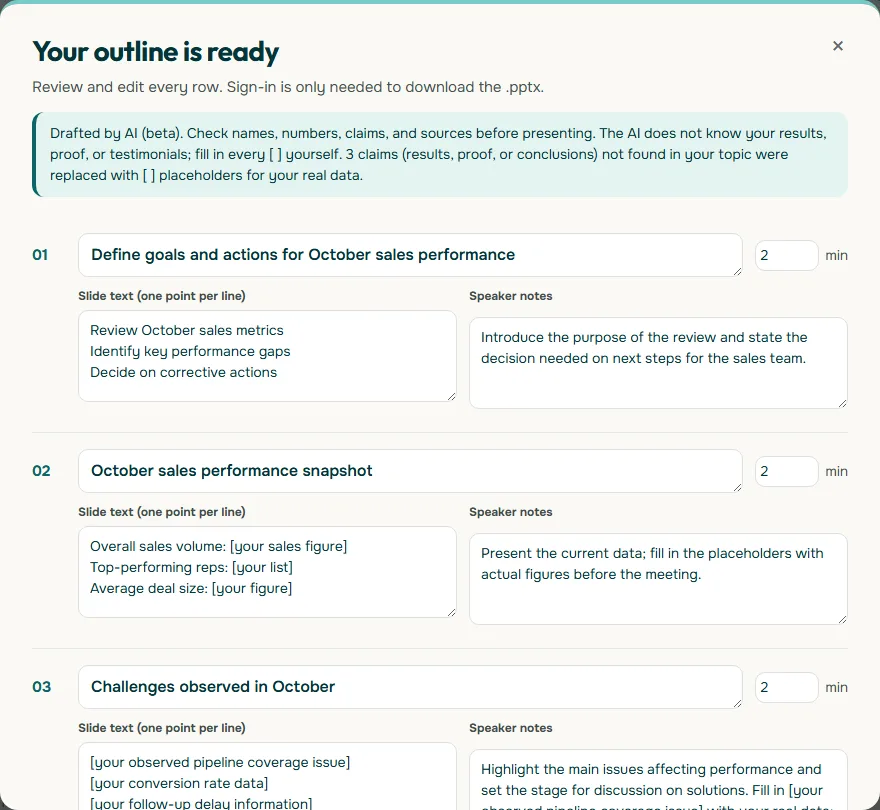
From an outline like this you can mark the layout of each row, as in the example above. A row with three points suits Title and Content, a row comparing two regions suits Comparison, and a data row suits Title Only with a chart. After signing in to the beta, you can download the outline as an editable .pptx file and polish it in PowerPoint. Try your first outline in the Soluslide outline builder.
Layouts for a thesis defense, a class, and a pitch
Each kind of presentation leans on slightly different layouts. You do not need a new layout per event, only a sense of which ones you will use most.
- Thesis defense. Examiners want to follow the research in order. Section Header slides mark the move from background to method, results, and conclusion, and results charts read best on Title Only. See thesis defense presentation for a full structure.
- A class lesson. Students need one idea per slide. Title and Content suits a definition, Two Content suits examples and non-examples, and Picture with Caption suits a photo or diagram that needs explaining. See also teaching presentation template.
- A small-business pitch. Investors and partners skim. Problem and solution slides work in Comparison, while a sales figure or target hits hardest on a Blank layout with one large number.
Whatever the event, the rule holds: the layout follows the job of the slide. Once you know each slide's job from the outline, choosing layouts becomes a quick decision instead of trial and error.
A layout checklist before you present
Before you save the final version, run this short check. Five minutes here usually saves you from slides that look messy on the projector.
- Titles sit in the same place. Scroll quickly through the thumbnail pane. A title that jumps around means a slide uses a manual box.
- One layout per job. Every bullet slide uses the same layout, and every section break uses Section Header.
- No empty placeholders. Prompt text such as "Click to add text" does not show in the slide show, but an empty placeholder can still leave the slide looking lopsided. Delete the ones you do not use.
- Consistent footer and slide numbers. Turn them on once from the Insert menu and apply them to all slides.
- Test at real screen size. Run the slide show and look at it from a few meters away.
If your team will reuse the deck, keep the tidy layouts inside a template. Finding and using templates is covered in free PowerPoint templates.
Common layout mistakes
- Drawing your own text boxes. Manual boxes do not update when the layout or theme changes. Use placeholders.
- Adjusting positions slide by slide. If every slide needs the same change, make it once in Slide Master.
- Forgetting to reapply a layout. Existing slides do not follow a layout you just edited until you reapply it.
- Too much variety. A deck with a dozen different layouts feels random. Four to six used consistently are usually enough.
- Forcing long content into one layout. If points overflow, split the slide in two rather than shrinking the font.
- Ignoring contrast. Layouts with picture backgrounds can make text hard to read. See readable presentation contrast.
Before you present, open Normal view and scroll through every slide. Check that titles sit in the same position and that no boxes overlap. For type that reads well on a big screen, see best fonts for presentations.
Frequently asked questions
What is a PowerPoint layout?
A layout is a built-in arrangement that sets the position and format of titles, text, pictures, and other objects on a slide through placeholders.
How do I change the layout of a slide?
Select the slide, go to the Home tab, click Layout, and choose a layout from the gallery.
What is the difference between a layout and a theme?
A layout sets where placeholders sit, while a theme sets colors, fonts, effects, and background. The theme applies to every layout.
How do I create a custom layout?
Open View, Slide Master, pick the closest layout or the Blank Layout, add placeholders with Insert Placeholder, rename it, and close master view.
Why did my existing slides not change after I edited the layout?
An edited layout has to be reapplied. Select those slides, then on Home click Layout and choose the updated layout.
Can I edit layouts in PowerPoint for the web?
You can switch a slide to another layout, but Microsoft says Slide Master view for editing layouts is not available in PowerPoint for the web.
How do I change the layout in Google Slides?
Select a slide, click Layout at the top, and select the layout you want.
How many layouts should one presentation use?
There is no fixed rule, but four to six layouts used consistently are usually enough and keep the deck tidy.
Sources
Factual claims in this article refer to the sources below. Sample outlines and prompts are illustrations to adapt.
Related reading
Try shaping your own outline. You can review and edit it before signing in.
Build a free outline