
PowerPoint Background: How to Set One and Keep Slides Readable
A good background makes slides feel considered without pulling attention from the content. This guide covers how to set one in PowerPoint and Google Slides, which type to choose, and how to keep text easy to read.

PowerPoint background: the short answer
A PowerPoint background is the color, gradient, pattern, or picture that sits behind everything on a slide. To change it, go to the Design tab, select Background Styles, and then Format Background. Your choice applies only to the current slide unless you select Apply to All.
Choosing well comes down to one rule: the background has to help the content get read. Text-heavy slides need a plain color or a soft gradient. A slide with a single sentence can carry a photo, as long as the area behind the words is calm.
This guide answers the three questions people ask most: how to set a background, which type suits which job, and where to find images you are actually allowed to use. It ends with a worked fix and a checklist. If you are working on the overall look of a deck, the presentation design guide shows how background, fonts, and color fit together.
How to change the background in PowerPoint
These steps follow Microsoft's own instructions for PowerPoint on Windows.
- On the ribbon, open the Design tab.
- Select Background Styles, then Format Background.
- Under Fill, choose Solid fill, Gradient fill, or Pattern fill for a color, or Picture or texture fill for a photo.
- For a photo, select Insert under Picture Source and pick your file.
- Select Apply to All if the background should appear on every slide. Without this step, only the current slide changes.
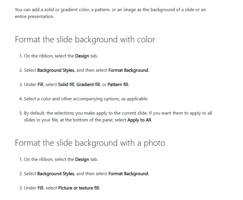
If a photo is too busy, drag the Transparency slider to the right to lighten it. To remove everything, return to the same pane, select Reset Background, and then Apply to All.
When the background has to match across every layout, setting it once in the Slide Master is cleaner. New slides pick it up automatically and you never repeat the steps above.
How to change the background in Google Slides
The flow is similar with different menu names. According to Google's help page, it works like this.
- Open your presentation in Google Slides and choose a slide.
- At the top, click Slide, then Change background.
- For a color, click the box next to Color. For an image, click Choose next to Image.
- Click Done for one slide, or Add to theme for the whole presentation.
Google limits background images to .gif, .jpg, or .png files under 50 MB, so convert a .webp image before you upload it.
If a deck moves between PowerPoint and Google Slides, recheck the background after the move. The guide on converting Google Slides to PowerPoint lists what else to inspect when the format changes. Opening the file on the machine you will present from is still the safest test.
Types of PowerPoint background and when to use them
No single type wins every time. The right pick depends on how dense the slide is, the room, and the impression you want to leave.
Scroll the table sideways to see every column.
| Type | Works for | Risk | Tip |
|---|---|---|---|
| Solid color | Text-heavy slides, tables, charts | Flat if every slide is identical | Choose one light or one dark tone, then add an accent |
| Soft gradient | Title slides, section dividers | Text fades near the lighter or darker end | Keep the two tones close together |
| Pattern or texture | Teaching material, events, themed decks | Lines interfere with letters | Keep the pattern at the edges and the text area clear |
| Full photo | Openers, quotes, one-sentence messages | Text sinks into photo detail | Use a calm area or add a dark overlay |
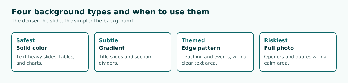
For formal settings such as a thesis defense or an internal team meeting, solid colors and soft gradients are the safe choice. People came for the content, and a quiet background lets them stay with it. Full photos work better on openers and section breaks where there is very little text.
You also do not need one background for the whole deck. A common pattern is a dark background for dividers and a light one for content slides. When the colors come from the same family, the switch looks deliberate rather than random.
Keeping text readable on a background
The biggest background mistake is not the color itself but the contrast. The WCAG 2.2 accessibility guideline sets a minimum contrast ratio of 4.5:1 for normal text and 3:1 for large text. It was written for web content, but the numbers make a useful benchmark for slides.
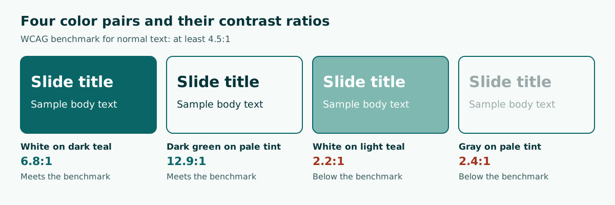
The pairs above show a familiar pattern. White text on dark teal reaches 6.8:1 and dark green text on a pale background reaches 12.9:1, so both pass. White on light teal gets only 2.2:1, and gray on a pale background gets only 2.4:1.
Photos are harder because the color changes at every point. Three practical fixes cover most cases.
- Put a solid colored box behind the text.
- Add a semi-transparent dark shape over the photo.
- Choose a photo with empty space and place the text there.
The guide to readable presentation contrast covers how to measure these colors in more depth. Keep in mind that projectors often wash colors out compared with a laptop screen, so leave a safety margin above the minimum.
Where to find background images, and what the license allows
Pulling an image from a search results page is not automatically safe, because every image has an owner. Start with sites that spell out their terms. Pexels is one example. Its license page says all photos and videos can be downloaded and used for free, and attribution is not required.
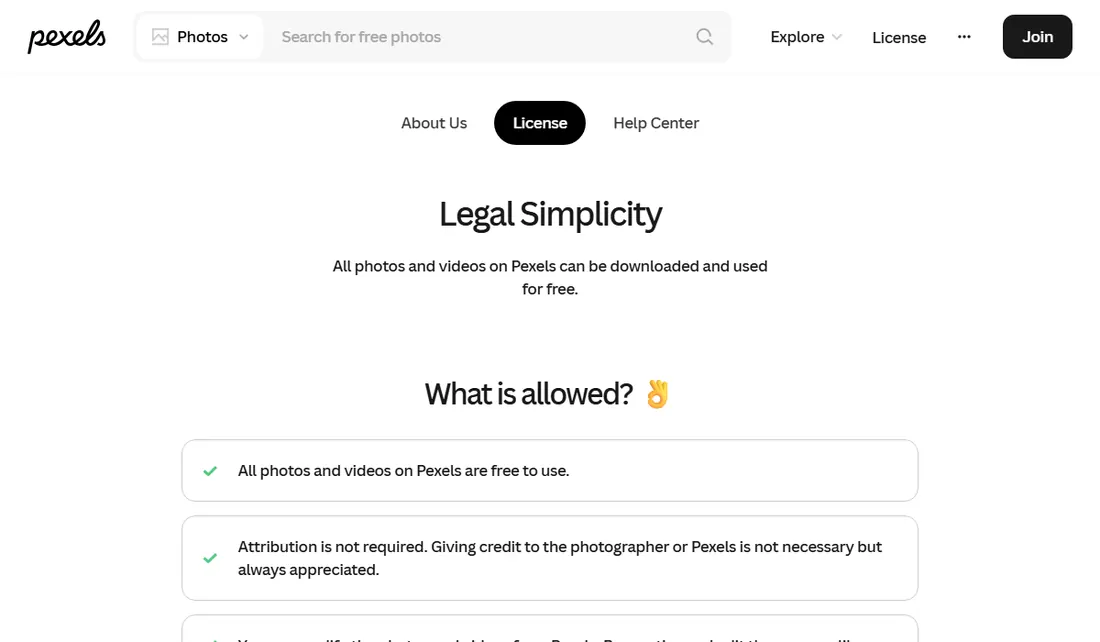
Free does not mean free of conditions. Pexels forbids, among other things, showing identifiable people in an offensive way and implying that a person or brand endorses your product. For business decks, photos without people or logos are simply easier to use.
Another option is to make your own. Solid and gradient fills in PowerPoint need no extra license, and they often look cleaner than a photo. If you need a full template instead of a single image, read up on slide design principles first so the choice is not just a trend.
Keep a note of where each photo came from, such as its page link. If the deck gets reused or published, that note saves time when someone asks about the source.
Background image size and quality
A blurry photo shows up immediately on a big screen. Before inserting an image, match its shape to the slide. Widescreen slides are 16:9, so a 1920 x 1080 pixel image fits without cropping. On a 4:3 slide the same image gets cut at the sides or looks stretched. The PowerPoint slide size guide has the details.
File size matters too. A high-resolution photo on every slide can bloat a deck until it is hard to send or slow to open. If the same photo appears on many slides, place it in the Slide Master. If the file has already grown, follow the steps for reducing PowerPoint file size.
Scroll the table sideways to see every column.
| Need | Guideline | Why |
|---|---|---|
| 16:9 slide | 1920 x 1080 pixel image | Same ratio, no cropping needed |
| Google Slides format | .gif, .jpg, or .png under 50 MB | Google's stated limit |
| Same photo on many slides | Place it in the Slide Master | Tidier, and you replace it once |
| Busy photo | Raise Transparency or add an overlay | Text becomes readable again |
Finally, never bury important information inside a background image. Text baked into a picture cannot be edited, cannot be read by a screen reader, and will not change when you swap fonts.
Example: fixing a sales report slide
Imagine a sales report slide with a warehouse photo full of shelves as the background, a white title, and three number-heavy bullets on top. The text is hard to read because it crosses bright shelves and dark shadows. Here is how to fix it.
- Move the photo to the opening slide only.
- Replace the content slide background with a light solid color.
- Change the text to dark green for strong contrast.
- Turn the three bullets into a simple chart.
- Keep one accent color for the most important number.
Before: warehouse photo + white text + 3 long bullets
After: light solid background + conclusion headline + 1 chart
New headline: Sales grew in two of three regions
Notice that the biggest gain did not come from a better photo. It came from removing things. A background is only the stage, and the message lives in the headline and the chart.
The order of work matters as well. Finish the content first, then pick the background. That way you know which slides are dense and which ones have room for a photo.
Start with content, then the background
Many people open PowerPoint and start browsing backgrounds before they know what the slides will say. Time goes to appearance and the content gets rushed. Try flipping the order: build the outline, decide the slide count and the message of each slide, and only then choose the look.
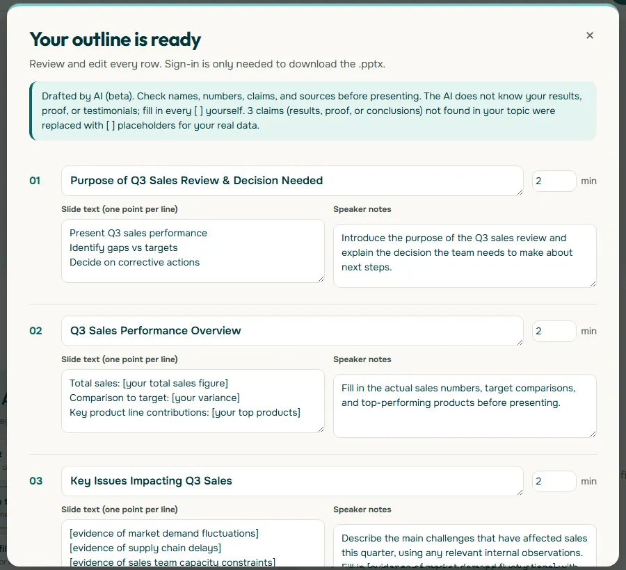
Soluslide can help at this stage. You enter a topic, an event type, and a duration, and get an outline with titles, notes, and minutes per slide that you can edit before signing in. That outline can then be exported as an editable .pptx file, so the background stays yours to change in PowerPoint.
Once the outline is ready, mark the dense slides and the breathing slides. Dense slides get a plain background. Breathing slides, such as your opening and closing, can carry a photo or gradient. This simple pattern is enough to make a deck look designed, and it stays true to the presentation structure you planned.
Common mistakes and a final checklist
Run through this list before you present.
- Only one slide changed. You skipped Apply to All.
- Backgrounds differ for no reason. Move the setting to the Slide Master.
- Text crosses light and dark areas. Add a solid box or a dark overlay.
- Blurry photo. Replace it with an image of the right shape and enough resolution.
- A watermark is visible. The image is not licensed for your use. Find another source.
- The file is huge. Compress images before sending.
- Never tested on the real screen. Try the projector or TV if you can.
One quick test is worth doing: step back from your laptop and check whether the headline reads within three seconds. If it does not, change the background or text color before touching anything else. A confident font choice helps too. Once the look is settled, work on your delivery, because no background can stand in for a clear presenter.
Frequently asked questions
How do I change the background on all slides in PowerPoint?
Open the Design tab, select Background Styles, then Format Background. Set your color or picture and select Apply to All at the bottom of the pane.
Why did my PowerPoint background change on only one slide?
Format Background settings apply to the current slide by default. Select Apply to All so every slide follows.
How do I use a picture as a PowerPoint background?
In the Format Background pane, choose Picture or texture fill, then select Insert under Picture Source. Drag the Transparency slider to the right if the picture is too busy.
What size should a PowerPoint background image be?
For a 16:9 slide, a 1920 x 1080 pixel image fits without cropping. The key point is that the image ratio matches the slide ratio.
What background color is easiest to read?
A light solid color with dark text, or a dark color with light text. Use the WCAG minimum contrast ratio of 4.5:1 for normal text as your benchmark.
Where can I find free PowerPoint backgrounds?
Use sites that explain their license, such as Pexels, which allows free use without required attribution. Read its list of restrictions too, especially for photos of people and brands.
How do I remove a background in PowerPoint?
Open Format Background, select Reset Background, then select Apply to All if you want every slide returned to the default.
Can I use a .webp image as a Google Slides background?
Google's help page says background images must be .gif, .jpg, or .png files under 50 MB. Convert other formats to one of those first.
Sources
Factual claims in this article refer to the sources below. Sample outlines and prompts are illustrations to adapt.
Related reading
Try shaping your own outline. You can review and edit it before signing in.
Build a free outline