
PowerPoint Color Palette: 6 Ready Palettes and How to Choose
The right colours make slides easy to read and look professional. This guide gives six ready palettes with hex codes, contrast ratios, and how to apply them.

What makes a good PowerPoint color palette
A good PowerPoint color palette makes slides easy to read and keeps them consistent: one calm background colour, one text colour with strong contrast against it, and one or two accent colours to highlight what matters. As a practical benchmark, body text should have a contrast ratio of at least 4.5:1 against its background, in line with the W3C WCAG guideline.
Many decks look busy not because the colours are ugly but because too many are used without a rule: a blue title, green bullets, an orange box, and a purple chart on the same slide. The audience then struggles to see what is important.
This guide covers the 60-30-10 rule for splitting colour, how to check contrast, six ready-to-use palettes with hex codes and contrast ratios, how to save a palette as PowerPoint theme colours, and the most common mistakes. If you have not chosen a base theme yet, also read our PowerPoint themes guide and slide design guide.
The 60-30-10 rule for splitting colour
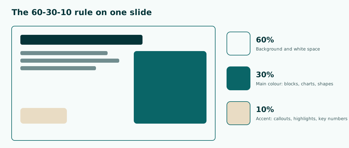
The 60-30-10 rule is a simple way to divide colour, borrowed from interior design and widely used by graphic designers. Give the colours on a slide three roles:
- 60 percent dominant colour. Usually the background and white space. Choose a neutral such as white, light cream, or very light grey.
- 30 percent main colour. Used for title blocks, shapes, and charts. This colour becomes the identity of the deck.
- 10 percent accent colour. Only for things that need attention, such as a key number, a call to action, or an important word.
The numbers are not a strict formula. They are a reminder that an accent has to stay scarce to keep drawing the eye. If the accent is everywhere, it stops being an accent.
Text colour sits outside this split. Body text needs just one dark colour on a light background, or one light colour on a dark background. A tidy split is also easier to keep when you use the slide master, because title and background colours are set once for every slide.
Check contrast before you pick colours
A colour that looks great on a laptop can wash out on a projector. So check text and background contrast with numbers, not by eye. WCAG 2.1 success criterion 1.4.3 asks for a contrast ratio of at least 4.5:1 for normal text and 3:1 for large text. Large text there means 18 point, or 14 point bold.
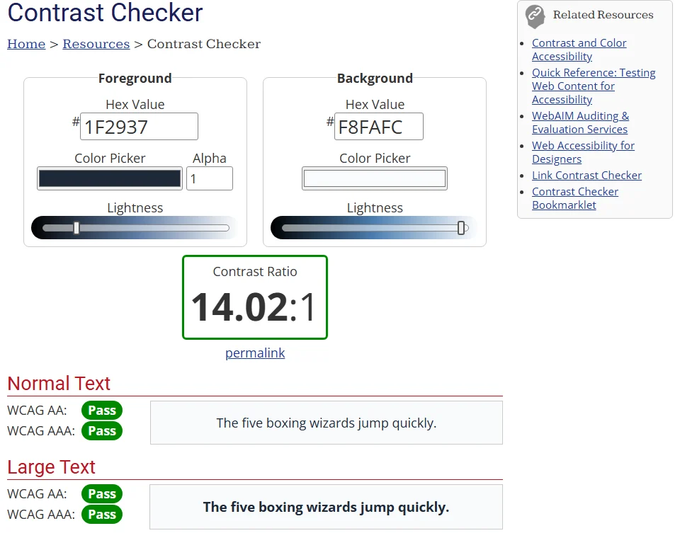
The easiest way is the WebAIM Contrast Checker. Enter the hex codes for text and background and read the ratio. In our test, dark grey text #1F2937 on a #F8FAFC background gave 14.02:1, passing every level for both normal and large text.
Counter examples: light grey #9CA3AF text on white is only 2.53:1, and yellow #FBBF24 text on white is only 1.66:1. Both fall below 3:1, so neither works for text, not even for large titles. For a deeper look at readability, see our readable presentation contrast guide.
Six ready-to-use PowerPoint color palettes
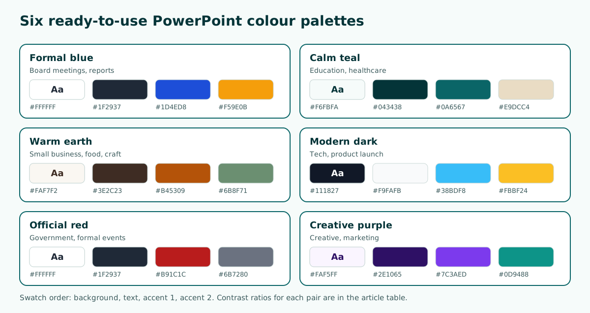
Here are six palettes you can use straight away. Each has a background, a text colour, and two accents. We calculated the text to background contrast with the WCAG relative luminance formula, so all of them are above 4.5:1.
Scroll the table sideways to see every column.
| Palette | Background | Text | Accents | Text contrast | Good for |
|---|---|---|---|---|---|
| Formal blue | #FFFFFF | #1F2937 | #1D4ED8, #F59E0B | 14.67:1 | Board meetings, reports |
| Calm teal | #F6FBFA | #043438 | #0A6567, #E9DCC4 | 12.93:1 | Education, healthcare |
| Warm earth | #FAF7F2 | #3E2C23 | #B45309, #6B8F71 | 12.36:1 | Small business, food, craft |
| Modern dark | #111827 | #F9FAFB | #38BDF8, #FBBF24 | 16.97:1 | Tech, product launch |
| Official red | #FFFFFF | #1F2937 | #B91C1C, #6B7280 | 14.67:1 | Government, formal events |
| Creative purple | #FAF5FF | #2E1065 | #7C3AED, #0D9488 | 14.19:1 | Creative, marketing |
Accents do not always work as text colours. In the Warm earth palette, for example, the brick orange #B45309 is dark enough for titles on cream, but the yellow accent in the Formal blue palette only works as a highlight block behind dark text, not as a letter colour. Re-check contrast whenever an accent is used for lettering.
If you need a photo or gradient background, choose the palette first and then adjust the background. Our guide to PowerPoint backgrounds covers that step.
Choosing a palette for the occasion
The right colours depend on the audience and the setting. Some practical guidance:
- Thesis defense and academic talks. Use a calm palette such as Formal blue or Calm teal. Examiners read a lot of text and charts, so contrast matters more than bold colour. See also our thesis defense presentation page.
- Team meetings and reports. Follow your organisation's brand colours if they exist. If not, Formal blue is a safe default.
- Small-business pitch. Take the main colour from your logo or packaging, then add a neutral background. Warm earth suits food and craft brands. See the AI pitch deck generator guide for structure.
- Classroom lessons. Use a light background and one bright accent for key terms, so students know what to note down. Our teaching presentation template shows a full layout.
In a bright room with an older projector, a light background is usually safer because dark text stays readable. A dark background suits dimmed rooms or large screens, such as at a product launch. If in doubt, test both versions in the actual room before the day.
Do not rely on colour alone
Not everyone sees colour the same way. WCAG success criterion 1.4.1 on use of color says colour should not be the only visual means of conveying information. On slides, that means labels, icons, or patterns should help carry the meaning.
Common examples: a line chart with three colours and no labels, or a status table that separates "done" and "late" only with green and red. Viewers who struggle to tell red from green lose that information. The fixes are easy:
- Put labels directly at the end of each chart line, not only in the legend.
- Add text or icons to statuses, such as a tick and an exclamation mark.
- Make chart bars differ clearly in lightness, not only in hue.
For meaningful graphics such as chart lines and icons, WCAG success criterion 1.4.11 asks for a contrast of at least 3:1 against the background. For example, the teal accent #0A6567 on #F6FBFA has a ratio of 6.54:1, safe for lines and icons. For tidy charts, see how to make a graph in PowerPoint.
Saving a palette as PowerPoint theme colors
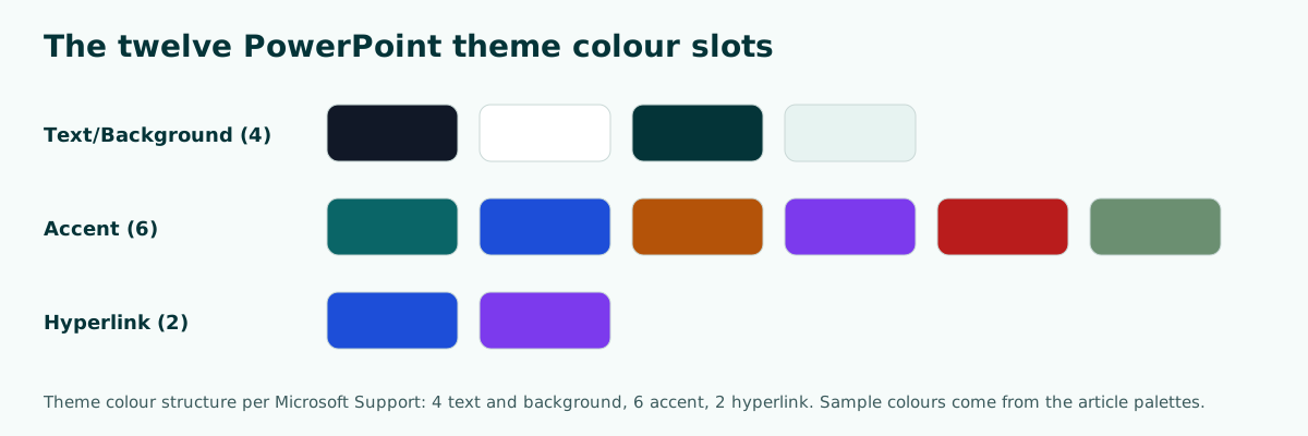
To keep a palette consistent across every slide, save it as theme colours. According to Microsoft Support, theme colours contain four text and background colours, six accent colours, and two hyperlink colours. The steps from Microsoft Support are:
- On the Design tab, click the arrow under Variants and point to Colors.
- Click Customize Colors.
- Click the colour box you want to change, for example Accent 1, and pick a new colour. For a hex code, open More Colors and use the Custom tab.
- Repeat for each colour, give the set a name, and save it.
Once saved, shapes, charts, and SmartArt pick up those accents automatically. You can also save colours, fonts, and effects together as a .thmx theme file to reuse in other presentations.
Put your main colour in Accent 1 and your accent in Accent 2, because charts and SmartArt usually take colours in accent order. More on SmartArt is in our SmartArt guide.
Text colour, titles, and fonts
A good palette still fails if the text is too thin or too small. A few rules help:
- Use one colour for all body text. Do not colour each bullet differently.
- Titles may use the palette's main colour as long as contrast stays above 3:1 at large sizes, and 4.5:1 is safer.
- Avoid coloured text directly on photos without a backing box. Contrast on a photo changes from one area to the next.
- Use the accent to emphasise one or two key words, not a whole sentence.
Fonts affect how colour reads as well. Thin letters make a colour look paler than its hex code suggests. Choose a medium weight for body text and bold for titles. Font pairing ideas are in our guide to the best fonts for presentations.
If slides will be printed, remember that office printers often darken dark colours and lose light ones. Print one test page before printing the whole deck. Print settings are covered in how to print PowerPoint slides.
Colour in charts and tables
Charts and tables are where colour most often gets messy, because PowerPoint gives every data series a different colour by default. Reset them to follow your palette:
- One series to highlight, one accent colour. Other series can be grey or a light tint of the main colour, so the audience looks straight at the data you are discussing.
- Keep the colour order the same across charts. If 2025 sales are teal on slide 4, keep them teal on slide 9.
- Use colour sparingly in tables. The header row can use the main colour with white text; the body only needs a white background and thin lines.
Once theme colours are set, new charts follow the accent order automatically. Steps for a tidy table are in how to make a table in PowerPoint. For a single important number, such as a growth percentage, simply set it large in the accent colour without an extra chart.
Example: building a palette for a small-business pitch
Say you are preparing a pitch for a local ground coffee brand. Its packaging is dark brown and brick orange. Use those as the base, then add a neutral background and a high-contrast text colour.
Background (60%) : #FAF7F2 very light creamBody text : #3E2C23 dark brown (12.36:1 on the background)Main colour (30%): #B45309 brick orange from the packagingAccent (10%) : #6B8F71 leaf green for key numbersRule : accent only on revenue figures and the call to actionCheck : every text pair in WebAIM, at least 4.5:1With this palette, the title slide uses a cream background with a dark brown title, data slides use brick orange charts, and one key figure such as revenue growth is marked in green. Those three colour roles tell the audience at once what is identity, what is content, and what is a highlight. For the full structure of a pitch, see our business plan presentation guide.
Common colour mistakes
Some colour mistakes appear again and again in class and work decks:
- Too many colours. More than three colours besides neutrals makes slides look busy.
- Light text on a light background. Yellow, light green, or light grey on white is barely readable on a projector.
- Loud gradient backgrounds. Text contrast changes from one side of the slide to the other.
- Red and green as the only difference. Add labels or icons.
- Colours changing slide to slide. Use theme colours to stay consistent.
- Never tested on the real screen. Laptop colours often differ from the room projector.
A quick check: switch the view to black and white or grayscale and see whether titles, text, and charts are still distinct. If they are, your contrast and colour split are in good shape. If your file is heavy because of coloured background images, see how to reduce PowerPoint file size.
From outline to coloured slides
Choosing colours is easier when the slide content is already clear. You know which slides hold data, which carry the key message, and where an accent is needed. That is why many people draft the outline first and apply the palette at the end.
Soluslide helps with that outline. Enter a topic or upload a document in the Soluslide builder, edit the titles and notes for each slide, then export an editable .pptx after signing in with a beta account. The exported file uses standard text boxes and shapes, so you can apply your own theme colours in PowerPoint with the steps above. Other capabilities are listed on the features page.
In short: pick one neutral background, one text colour with at least 4.5:1 contrast, one main colour, and one accent. Save them as theme colours, test on the real screen, and never let colour be the only signal of meaning.
Frequently asked questions
What is a good color palette for PowerPoint?
One neutral background, one text colour with at least 4.5:1 contrast, one main colour, and one accent. For example white, text #1F2937, blue #1D4ED8, and a yellow accent.
How many colors should a PowerPoint use?
Usually one background, one text colour, and one or two accents. More than that tends to make slides look busy.
What is the 60-30-10 rule for slides?
A colour split: 60 percent dominant colour for the background, 30 percent main colour for blocks and charts, and 10 percent accent for highlights.
What contrast ratio should slide text have?
WCAG asks for 4.5:1 for normal text and 3:1 for large text, meaning 18 point or 14 point bold.
Should a PowerPoint background be light or dark?
A light background is safer in bright rooms and with ordinary projectors. A dark one suits dimmed rooms or large screens. Test both in the real room.
How do I change theme colors in PowerPoint?
On the Design tab, click the arrow under Variants, point to Colors, and choose Customize Colors. Change boxes such as Accent 1, name the set, and save.
How do I check the contrast of my slide colors?
Enter the text and background hex codes in the WebAIM Contrast Checker. Aim for at least 4.5:1 for body text.
Can I use red and green to separate data?
Yes, as long as you add labels, icons, or patterns. WCAG says colour should not be the only way information is conveyed.
Sources
Factual claims in this article refer to the sources below. Sample outlines and prompts are illustrations to adapt.
- Microsoft Support: Create your own theme in PowerPoint
- Microsoft Support: Create or delete a custom theme color
- W3C WAI: Understanding Success Criterion 1.4.3 Contrast (Minimum)
- W3C WAI: Understanding Success Criterion 1.4.1 Use of Color
- W3C WAI: Understanding Success Criterion 1.4.11 Non-text Contrast
- WebAIM: Contrast Checker
Related reading
Try shaping your own outline. You can review and edit it before signing in.
Build a free outline