
How to Make a Presentation Interesting: Content People Remember
An interesting presentation is not about animations or a pricey template. It has one clear message, relevant evidence, and slides that can be read from the back row.
What makes a presentation interesting
To make a presentation interesting, build it around what your audience needs: one clear key message, relevant evidence, slides that are easy to read, and a concrete next step. Interesting does not mean full of animations, loud colours or an expensive template. People pay attention when they feel the content helps them decide or do something.
In practice, interesting presentations nearly always share five elements:
- A clear goal. You know what the audience should understand, decide or do afterwards.
- One key message. One sentence you want them to remember, not ten.
- Evidence. Data, real examples or a short story that supports the message.
- Simple visuals. Charts, photos or diagrams that help, not decorate.
- A next step. A specific action.
Microsoft Support puts the core idea simply: you want your audience to listen to you present your information, rather than read the screen. Every step in this guide follows from that. If you need the overall skeleton first, read our guide to presentation structure.
Start with the goal and the audience, not the slides
The most common mistake is opening the slide app and filling in slide one. The result is a deck that holds everything you know rather than what the audience needs. Before you write a single slide, answer three questions on paper:
- Who is the audience? A manager who needs a quick decision, an examiner judging your method, or a buyer who wants to know the benefits.
- What do they already know? Familiar parts get a brief mention. New parts need examples.
- What should happen after the talk? A budget approval, an understood concept, or a purchase.
The answer to question three is your goal. Write it as one sentence, for example "The marketing team approves the priority order of promotion channels for next quarter." Any slide that does not serve that goal can be cut or moved to an appendix.
The goal also sets the length. A 10-minute team meeting does not need 30 slides. Our guide on how many slides for a 10 minute presentation helps you pick a sensible number for your time slot.
Write one key message and turn it into slide titles
Once the goal is clear, write the key message: one sentence you want people to repeat to colleagues after they leave the room. A key message is not a topic. The topic is "social media promotion strategy". The key message is "ad costs are rising, so we focus on the two channels with the lowest cost per customer".
A technique that helps a lot is writing slide titles as messages, not labels. Compare:
Scroll the table sideways to see every column.
| Label title | Message title | Why it is more interesting |
|---|---|---|
| Background | Ad costs are up, so priorities must change | The audience sees the problem at once |
| Sales data | Instagram sales fell two months in a row | The number has meaning, not just a table |
| Proposal | We move part of the budget to the most efficient channel | The proposal sounds like a decision |
| Closing | Today we decide the channel priority order | The audience knows what is being asked |
If someone reads only the titles in order, they should already get the whole story. It also makes rehearsal easier, because each slide has one sentence you need to explain. For an opening that grabs attention straight away, use the techniques in our guide on how to start a presentation.
Order each part: goal, message, evidence, visual, next step
Interesting content feels like it flows because every part follows the same order. A simple pattern that works for almost any presentation:
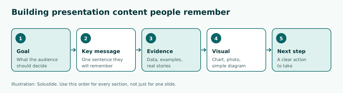
- Section goal. What this part should make clear.
- Key message. Written as the slide title.
- Evidence. One to three data points, examples or quotes that back it up.
- Visual. A chart or image that makes the evidence faster to grasp.
- Bridge or next step. A sentence that links to the next part, or a call to action at the end.
For a 10 to 15 minute talk, three main sections are usually enough. Beyond that, people start to lose the thread. Your closing should repeat the key message and name the next step in concrete terms; sample lines are in our guide on how to end a presentation.
Keep details that do not fit on the slide in your speaker notes. There you can write full figures, sources and transitions without crowding the screen.
Add evidence: data, examples and relevant stories
A key message without evidence sounds like an opinion. Evidence earns trust and makes the content feel alive. Three kinds are used most often:
- Data. Sales figures, survey results or test results. Show only the numbers that support the message, and name the source on the slide or in your notes.
- Real examples. A customer case, a past project or a screenshot of real work. Examples make abstract ideas feel close.
- Short stories. One person's experience or one event that shows the problem. A good story takes three to five sentences.
Pick evidence that is closest to your audience. In an internal meeting, your own team's data is more convincing than a general statistic from the internet. In a thesis defense, your own results are the main evidence, not theory the examiners already know.
One firm rule: never invent numbers. If the data is not ready, write a placeholder such as [October sales figures] in the draft and fill it with the real figure before you present. Outline tools like Soluslide do the same, replacing unsupported claims with square-bracket placeholders for you to fill in. If your evidence is numeric, present it with the right chart; see our guide on how to make a graph in PowerPoint.
Example: rewriting a slide that is too dense
Dense slides are the main enemy of interesting content. W3C WAI notes that it is difficult for many people to read text and listen to the speaker at the same time, so avoid putting lots of text or other content on slides. Microsoft Support also recommends bullets or short sentences, ideally one line each without wrapping, because some projectors crop slides at the edges.
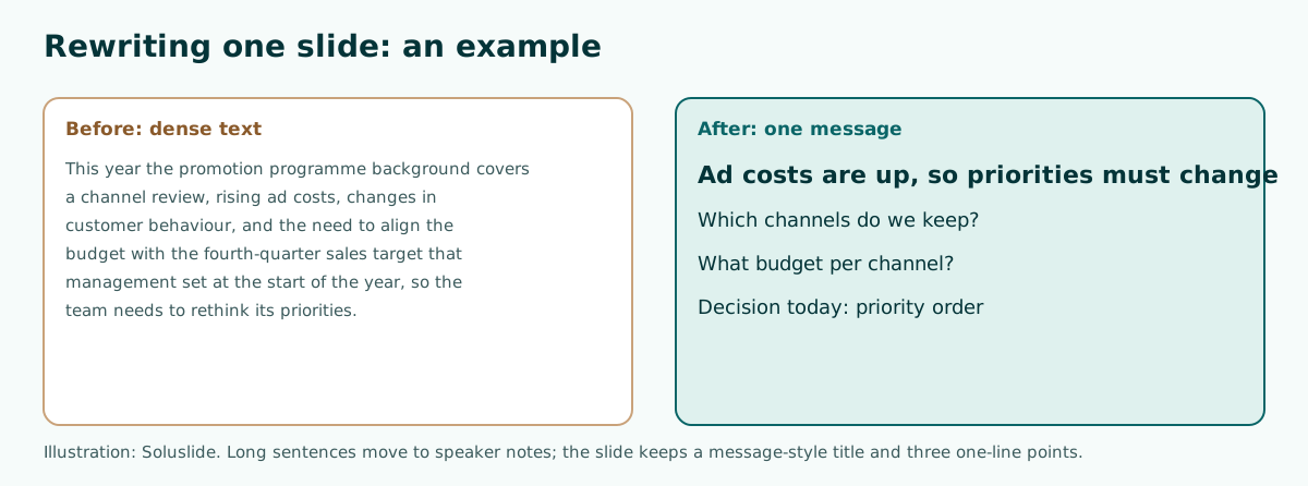
How to rewrite a dense slide:
- Read the paragraph and ask: what is the single most important sentence? Make it the title.
- Keep at most three supporting points, one line each.
- Move the rest to speaker notes or an appendix.
- Add one visual if it helps, such as a chart of ad costs.
The example above started as a background slide with six lines of long sentences. After the rewrite, the title states the problem, three points pose the questions the talk will answer, and the last point names the decision being asked for. Now the audience has a reason to listen to the end.
Choose visuals that help, not decorate
Visuals make content faster to understand, but only when each image has a job. Microsoft Support recommends using graphics to help tell your story, without overwhelming your audience with too many graphics on one slide. Chart labels should use only enough text to make the chart understandable.
How to pick a visual:
- Comparing numbers: use a bar or line chart, not a full table.
- A process or sequence: use a simple flow diagram or SmartArt.
- Real products, places or people: use real photos, not illustrations. Safe image sources are covered in our guide to images for PowerPoint.
- Abstract ideas: a simple icon can help; see PowerPoint icons.
Keep the look calm. Microsoft Support advises subtle, consistent slide backgrounds and a template or theme that is not too eye-catching, so the design does not distract from your message. Colours that stay readable on a projector are in our PowerPoint color palette guide.
Visuals also need to be said out loud. W3C WAI asks speakers to cover all the information on each slide, including graphics, in what they say. So instead of "as you can see in the chart", say what is shown, for example "cost per customer from channel A is double that of channel B".
Make sure the back row can read it
Even great content fails if nobody can read it. A few measures you can check right away:
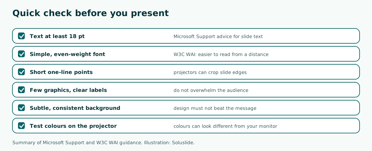
- Font size. Microsoft Support advises avoiding font sizes smaller than 18 pt, and going larger for a big room.
- Typeface. Pick a simple font such as Arial or Calibri. W3C WAI adds that fonts with consistent thickness are often easier to read from a distance, while fonts with thin parts are harder to read. Safe choices are in our guide to the best fonts for presentations.
- Contrast. Dark text on a light background or the reverse. Measurable contrast checks are in our readable presentation contrast guide.
- Test on the real screen. Microsoft Support warns that colours may project differently than they appear on your monitor, so check before the actual presentation.
The fastest test: put a slide on the screen and walk to where the back row sits. If you have to squint, so will they.
Drafting the outline faster with Soluslide
The hardest part is usually starting from a blank page. That is where a tool can speed up the first step. Soluslide builds a slide outline from a topic or a document you provide, with titles, one-line slide text, speaker notes and minutes per slide, which you can edit before signing in.
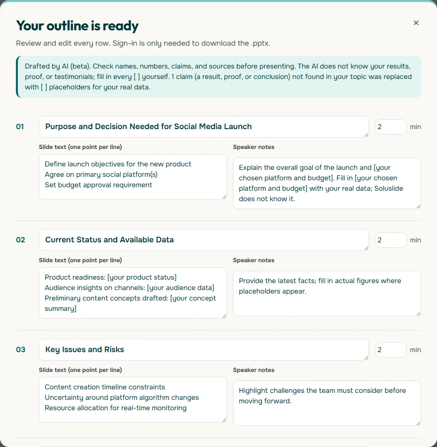
In our test with the topic "launch plan for a new product on social media" for a 10-minute meeting, the first slide title was already a message ("Purpose and Decision Needed for Social Media Launch"), and data we had not supplied was replaced with placeholders such as [your audience data]. You still need to review an outline like this: rewrite any titles that are still labels, fill every placeholder with real data, and cut points that do not serve the goal.
Once the outline is tidy, export an editable .pptx for PowerPoint, then add visuals and evidence. If your content starts as a report or meeting notes, try the presentation from document workflow. To try it now, open the Soluslide outline builder.
Mistakes that make a presentation boring
- Reading the slides. If everything you say is already on screen, people read faster than you speak and stop listening. That is why Microsoft Support recommends keeping text to a minimum.
- Too many topics. Three messages explained well stick better than ten mentioned in passing.
- Data without meaning. A table full of numbers with no "so what" confuses people. Put the conclusion of the numbers in the slide title.
- Too much decoration. Animations, transitions and busy backgrounds pull attention away. Use them sparingly; our guide to PowerPoint animation explains when they help.
- No next step. The talk ends with "thank you" and nothing else. People leave without knowing what to do.
- No rehearsal. Good content still feels stiff if the speaker has not practised. Delivery is covered in our guide on how to give a good presentation.
Before you present, ask a colleague to look at your slides for two minutes and then state the key message. If their answer matches the message you wrote, your content is doing its job.
Frequently asked questions
How do you make a presentation interesting?
Set a clear goal, write one key message, use message-style slide titles, back them with real data or examples, choose helpful visuals, and end with a concrete next step.
What makes presentation content engaging?
A clear goal, one key message, relevant evidence, simple visuals and a specific call to action, on slides that are easy to read so people listen instead of reading.
What font size should slide text be?
Microsoft Support advises avoiding font sizes smaller than 18 pt, and going larger for a big room where the audience sits far away.
How much text should be on one slide?
As little as possible. Use bullets or short sentences, ideally one line each, and move longer explanations to your speaker notes.
Do animations make a presentation more interesting?
Not necessarily. Too many animations and transitions distract from the message. Use them only to show an order or a change that matters.
What visuals work best in a presentation?
Charts for comparing numbers, diagrams for processes, real photos for real products or places, and simple icons for abstract ideas.
How do I make data slides less boring?
Put the conclusion of the numbers in the slide title, show only the figures that support your message, and use a simple chart with minimal labels.
Can AI help create presentation content?
Yes, for a first outline, but you must review it. Rewrite titles that are still labels and replace every placeholder with your real data.
Sources
Factual claims in this article refer to the sources below. Sample outlines and prompts are illustrations to adapt.
Related reading
Try shaping your own outline. You can review and edit it before signing in.
Build a free outline